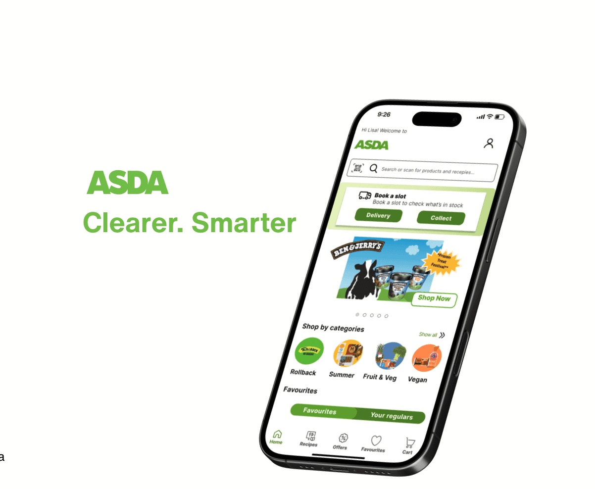
Redesign grocery app:ASDA.Clearer.Smarter
about.
This project began with one question: why does ordering groceries on the ASDA app feel harder than it should? I found clunky navigation, repetitive screens, and a slot booking process that drained users, especially busy parents. I redesigned the Home, Browse, and Slot Booking screens to reduce friction and simplify the experience. Using real user reviews and a persona based on common pain points, I restructured layouts, improved clarity, and made key tasks easier to complete. This case study shows how small, focused changes can make a big difference for everyday users trying to shop quickly and without stress.
This project began with one question: why does ordering groceries on the ASDA app feel harder than it should? I found clunky navigation, repetitive screens, and a slot booking process that drained users, especially busy parents. I redesigned the Home, Browse, and Slot Booking screens to reduce friction and simplify the experience. Using real user reviews and a persona based on common pain points, I restructured layouts, improved clarity, and made key tasks easier to complete. This case study shows how small, focused changes can make a big difference for everyday users trying to shop quickly and without stress.

problem.
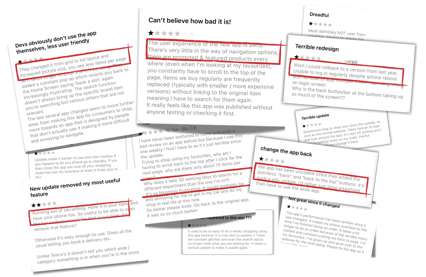
The ASDA mobile app creates unnecessary friction for users trying to complete basic tasks like booking a delivery slot or browsing products. Its clunky navigation, lack of structure, and repetitive prompts lead to confusion and wasted time. The problem isn’t complexity; it’s inefficiency. Regular users, especially those relying on the app for weekly grocery shopping, find the experience frustrating and time-consuming. The app doesn’t support their need for speed, clarity, or convenience in completing everyday tasks.
The ASDA mobile app creates unnecessary friction for users trying to complete basic tasks like booking a delivery slot or browsing products. Its clunky navigation, lack of structure, and repetitive prompts lead to confusion and wasted time. The problem isn’t complexity; it’s inefficiency. Regular users, especially those relying on the app for weekly grocery shopping, find the experience frustrating and time-consuming. The app doesn’t support their need for speed, clarity, or convenience in completing everyday tasks.
solution.
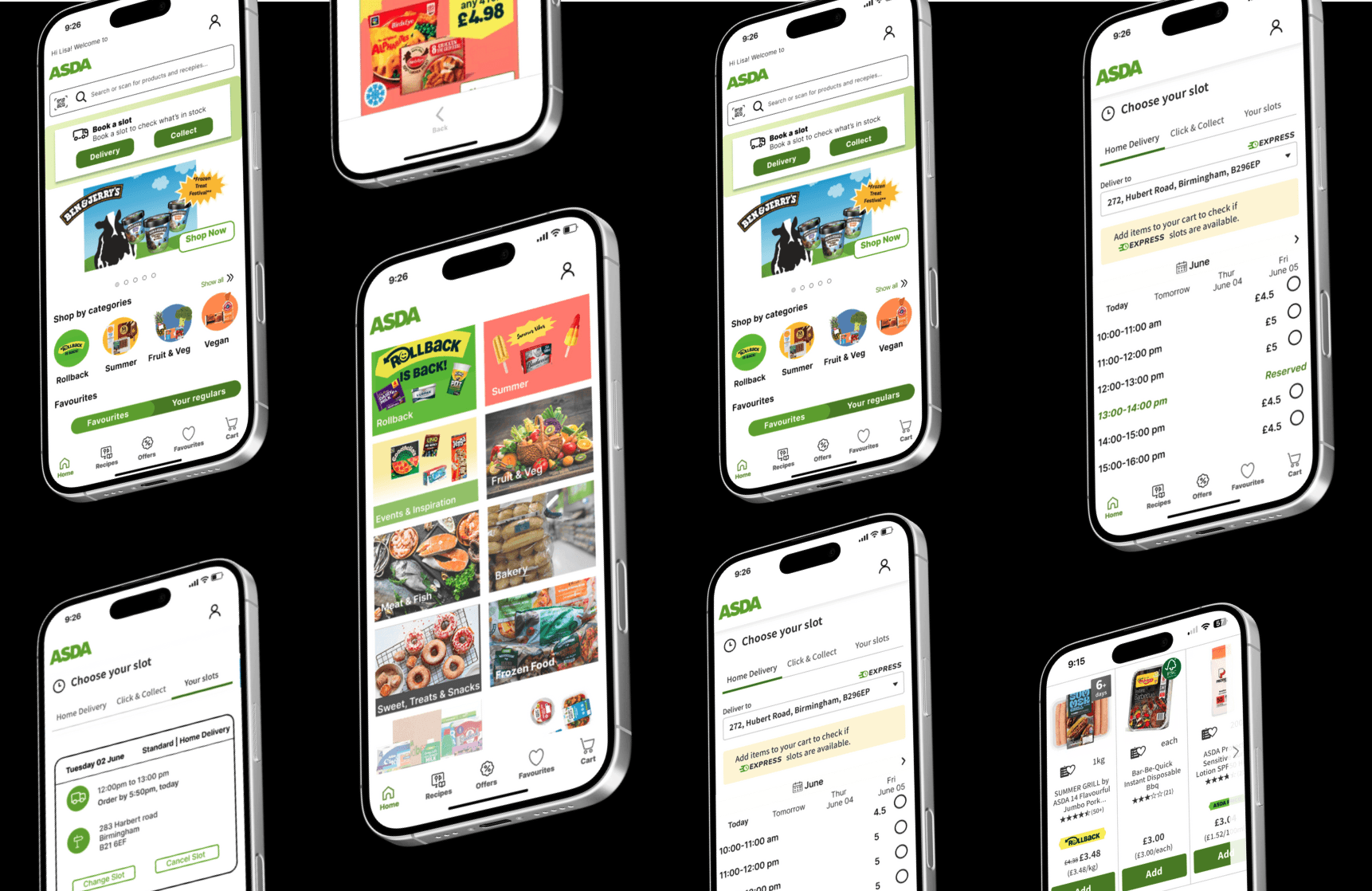
I focused on three high-friction areas:
The Home screen: simplified it to prioritize what users come for most: past orders, current offers, and delivery info.
The Browse section: reorganized categories and improved visual hierarchy to reduce overload and make discovery easier.
The Slot Booking page: redesigned it so users could view, select, or change their slot in one flow, with fewer interruptions.
All changes were based on real user reviews and guided by a persona grounded in their pain points. I created wireframes to rethink layout and hierarchy, then built high-fidelity mockups that brought clarity and breathing room to each interaction.
impact.
The redesigned flow significantly reduces user effort. Booking a slot now takes half as many steps as before. Reordering is visible right from the home screen, so frequent users don’t have to dig through menus. Visual clutter has been stripped back, making it easier for users to stay focused and feel in control.
The redesigned flow significantly reduces user effort. Booking a slot now takes half as many steps as before. Reordering is visible right from the home screen, so frequent users don’t have to dig through menus. Visual clutter has been stripped back, making it easier for users to stay focused and feel in control.
conclusion.
This wasn’t a full rebrand; it was a focused redesign rooted in empathy and logic. I didn’t try to make the app flashier. I made it easier to use. The process reminded me that real UX work isn’t about reinventing the wheel. It’s about noticing where people are getting stuck and removing the friction that gets in their way.
This wasn’t a full rebrand; it was a focused redesign rooted in empathy and logic. I didn’t try to make the app flashier. I made it easier to use. The process reminded me that real UX work isn’t about reinventing the wheel. It’s about noticing where people are getting stuck and removing the friction that gets in their way.